Fresh meals, fresh look
Celtic’s creative team quickly realized that the brand’s commitment to using fresh, locally sourced ingredients whenever possible was just the thing to inspire a fresh new look for the restaurant brand.
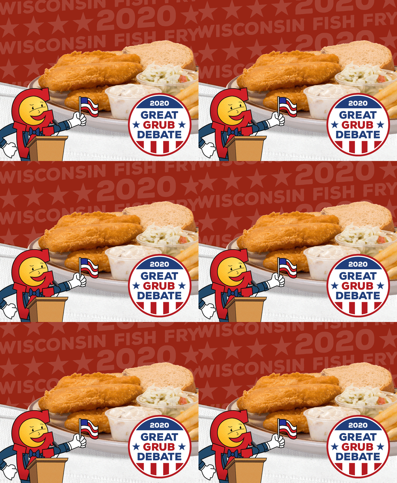
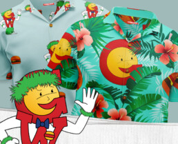
We updated the iconic brand’s look by using bright, clean photography on in-store collateral (think posters, placemats, and window clings). But the biggest update was to the restaurant’s mascot, George. Clean lines, a friendly face, and a cheery attitude gave the mascot a modern look while keeping a little retro flair.
Celtic created a series 12 fun, :15 videos for broadcast and social media inviting diners to take a closer look at Webb’s along with featuring all the great food deals the restaurant has to offer.
How do you know when a burger's going places? It's on a roll!
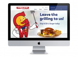
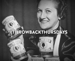
When it was time to update the company’s website, we carried the fresh, clean look through in design and copy. Not one to shy away from a bit of humor, the restaurant’s website and social media feed gives a voice to one of Milwaukee’s most beloved restaurants.

